

Pick This Font, Not That...
Let's face it.. selecting a font is the most important part of a text decal. Some people like to use my preselected fonts and some like to select a custom one from dafont.com. Either way it's your choice! But keep in mind... not all fonts create great looking decals and here's why.
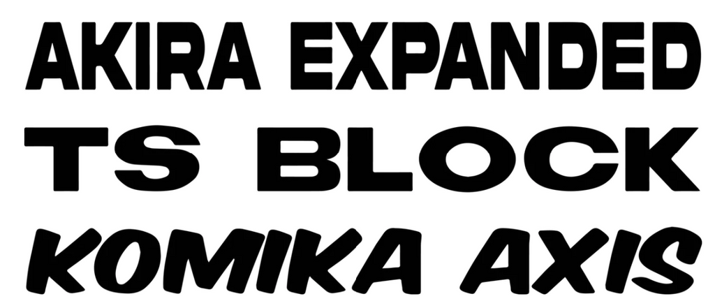
- Readability: Isn't the point of a decal for anyone to be able to read it? Select a font that doesn't take a lot of time to understand the message. Pick this (Komika Axis), Not that (North Point).
- Line Thickness: Decals are a series of cut lines. The thinner the lines, the less noticeable it will be and also risks not adhering to the surface. Go bold! Pick this (Jumper), Not that (Roboto).
- Script Font: Let's be honest - I love a great script font but it saddens me that reading script is not part of classroom curriculum anymore. It's classy yet an art that might not be appreciated in the future. If you like script - still go for it! Pick this (Cream Cake), Not that (Lambresia).
- Tattered: It's difficult to bring text to life that isn't solid. Pick this (Brightoven), Not that (Broken Glass).
If you stick to these guidelines then selecting a font will be a breeze. Always add your style to the creation!